This is a continuation of previous discussion of the thermal envelope design per the Passive House Planning Package. The initial design studies were boxes, for simplicity and for efficient use of the narrow site. But does the passive house need to look boxy? Of course not. But its deviation from boxiness should be a result of spatial motives, and should not compromise performance. There are certain view and volume vectors that the site welcomes: forward, back, and up, in particular. Returning to the organic analogy, this creature will define itself relative to these: a two-faced being (we'll call her/him Janice/Janus), greeting neighbors on the street and the family in the back yard, and with great eyes to Jove above and south. (I don't really have a Roman thing going, but it turns out that Janus is also the patron of concrete, which warms an architect's heart.) The north side is the back, minimally punctured, a big blanket-wall, which folds to become roof above.
All these ideas are tumbling together in the sketchbook, of which this is probably about the sixth page:
Ideas about the south windows in the front living room turning the corner to open up the space; the house takes on an asymmetry that expresses its purpose and brings drama (p. 7-ish):
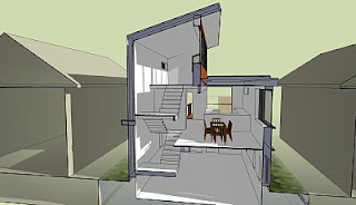
The entry sequence works with the compression of the site and sets up a big moment of light and space once the front door opens. I go into SketchUp to create the model, and here's a section of that space:
You can see how that north wall is receiving a lot of light (heat) and bouncing it back into the house; this shot is 12:30 on January 12. I also inserted some furniture into the model to test the spaces--the rooms are small, the house is small, but it still accommodates what we need (model shot in Spring):
To get a sense of the front composition, quantitatively determined by PHPP, and qualitatively determined by spatial and light qualities, I render it (using Podium, a SketchUp plug-in):
The odd zigzag in the front window is light falling on the interior stair. Here's an overview from the northwest:
The idea of the balconies is that they have a "green screen" growing wall for climbing plants--really grounding the house. The siding is cedar, in a rainscreen application, with steel copings and north wall/roof cladding. The green roof helps manage water, mitigates the heat island effect, extends the life of the roof, and saves energy. This is a quick study, and I feel it needs development in the porch elements especially, but overall I'm satisfied with a dynamic and expressive composition thoroughly based on performance. There is much to discuss with the cladding concepts, water management, site development, etc...some other time.
Our next step would be to move into ArchiCad, our "virtual building" program that is an integrated 3d parametric model with 2d document creation, where we generate all plans, details, schedules, etc.


Tidak ada komentar:
Posting Komentar