Welcome to my refrigerator door series. This series will consist of several posts showing options for the design of the refrigerator door. My first post of this series focused on hiding refrigerators in a kitchen followed by my second post on single door refrigerators. Click here and here to see those two posts.
In this post, I will focus on pairs of refrigerator/freezer doors; some are side-by-side while others are separated; some have drawers below while others do not; some match the kitchen cabinets while others are totally different; one has a glass door while the other is a solid doors. Lots and lots of options are shown in the photos below. Enjoy!
Source: The New Smart Approach to Kitchen Design by Susan Maney
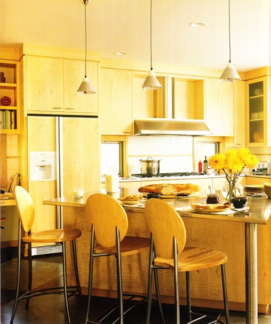
^In the photo above, is a standard side by side refrigerator freezer. The door panels match the maple cabinets. I think the stainless handles and stainless ventilation piece at the bottom of this refrigerator actually work well because this kitchen has touches of stainless throughout.
Source: Beautiful Kitchens Winter 2009
^The refrigerators or refrigerator and freezer shown above with the bank of drawers between is a great look for the right kitchen. This one could have been used in my first post of this series- disappearing refrigerators. I must note that when I see a bank of drawers that tall, I wonder what does one put in the the top few drawers that are hard to reach?
Source: Kitchen Ideas That Work by Beth Veillette
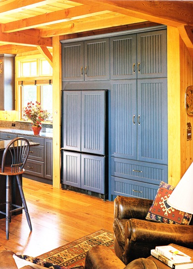
^The panels on these refrigerator doors shown above do not have drawers below but are designed to look like they are an upper and lower cabinet.
Source: Beautiful Kitchens Summer 2009
^A double refrigerator door design that blends with the style of the kitchen- which has a lot going on. The upper cabinets are a different style and finish than the lower cabinets. The refrigerator is unique unto itself. There is wood panels on the upper walls and ceiling and some sort of stone or tile design for the backsplash. Again, I am not able to see the entire kitchen but judging from this one photo, it seems busy.
Source: Beautiful Kitchens Winter 2009
^The side-by-side refrigerator shown above somewhat disappears as if it is a piece of furniture. I love the thought of having such a wide refrigerator which takes a large kitchen to pull it off.
Source: Great Kitchen Ideas a book
^The side-by-side refrigerator shown above is shorter than some others shown in this post which allows for the open shelf above. This is a good example of form over function. The design of the area above the refrigerator is quite handsome but in order to have this look one has to opt for a shorter refrigerator which means less storage room in the refrigerator. It is the preference of the homeowner who is building or remodeling. What would you choose?
Source: Beautiful Kitchens Magazine Spring 2010
^When I turned the magazine page and saw this photo, I had to do a double take. This barn door design definitely makes the refrigerator the focus of the kitchen. What do you think about this one?
Source: Beautiful Kitchens Magazine Winter 2009
^The side-by-side refrigerator shown above is narrow. They may both refrigerators with the freezer being in the four drawers below. Or they may be a refrigerator and a freezer. Another possibility is that this unit represents just refrigerators above and below and the freezer is located in laundry room or butler’s pantry.
Source: A New Smart Design Approach to Kitchen Design by Susan Marney
^In the photo above, you will notice that not only is the refrigerator door that of a painted barn scene but so are the kitchen cabinets.
Source: Kitchen Ideas That Work by Beth Veillette
^I assume the decision for this refrigerator to stick out from the wall unit instead of being flush is so that the door can fully open. Though cost is always a factor, I wish the sides of the refrigerator and the ventilation panel at the bottom that are showing were less obvious. I also think adding hardware to the refrigerator would have been an aesthetic plus.
Source: Beautiful Kitchens 2006
^Above is a handsome wall unit that holds either two refrigerators or a refrigerator and a freezer.
Source: Liebherr Advertisement, magazine unknown
^For a more contemporary look, the side-by-side refrigerator and freezer in stainless works well in this kitchen.
Source: Kitchens Book by Chris Casson Madden
^In the kitchen above, the homeowner opted for a more commercial/professional looking kitchen with their choice of refrigeration units.
Source: Kitchen Ideas That Work by Beth Veillette
^Having a glass door on a refrigerator is a cool look, especially this one that has been styled with lots of white items. I am not so sure I would want to see inside my refrigerator on a daily basis. What about you?
Blessings. …susan
PS Please come back for the 4th post of my series.


Tidak ada komentar:
Posting Komentar